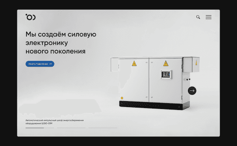


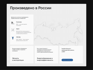
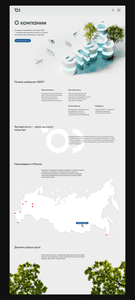
Micro-animations in the interface. Sometimes where you don't expect them, for example, in the footer


Mobile catalog

Mobile product card

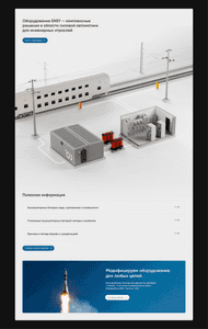
The header image shows the main types of vehicles for which Ensy manufactures equipment to support operation

List of posts

The post

The post Mobile View

Mobil View post list

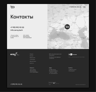

And one more small but very important picture.
About This Project
We wanted to create a website that would be noticeably different from all competitors in the energy equipment segment, emphasize the innovativeness and technology of the manufacturer, and help to distinguish the Ensy brand from other market players.
The style of the site is based on the use of a strict grid, free space, informative renderings and neutral light gray color - this is the shade in which most of the manufactured equipment is made. The choice of this style allows the company to stand out from its competitors and evoke an association with something measured, thoughtful and technological.
3d graphics were used to visualize Ensy products. This allowed to achieve a high level of detail of objects, a unified style, as well as significantly reduce budgets compared to photography. You can learn more about 3D graphics development in the project renderings for Ensy.tech.
The product card is assembled like a constructor. Paragraphs can be placed in any order and in any number depending on the requirements.
Url
ensy.techTeam